
BIG Thunder
BIG サンダー
(Japanese follows. / 日本語は以下へ続く。)
"BIG Thunder" is produced by Yuraku Confectionery Co., Ltd. and the company is most known for Black Thunder, a pocket-size chocolate snack.

When they mixed chocolate with cocoa crunch, it had rich flavor, and the color was quite "dark" and "black."
5 employees who were in charge of planning discussed how to show the black image, and they came up with "Black Thunder," and also an ad-line, "Tastiness is like Inazuma (lightning)!" was created by the same people later.
According to the HP, Black Thunder was first created in 1994 at Toyohashi factory in Gunma, and all the letters were in alphabet.
Then, in 2000, they renewed the package and added the line, "Tastiness is like lightning!"
In August, 2003, they changed the package again and the product name is all in Katakana and it's been this package till now (as of January, 2015).

About this BIG Thunder, HP says "NEW" but I couldn't find any launch date, but I think they just renewed the package design as it's described as "the BIG Thunder is now in red!"
Both sides had zig-zag lightening patterns in black.
 On the package, there's a line at the bottom, "雷神亭まんぷく!!! (Raijin Tei Manpuku)" but I actually am not familiar with what it means.
Raijin is a god of thunder, lighting and storm, and Tei (亭) is often used for a restaurant name as its original meaning is kiosk, chickee, lodge or barn in Chinese.
Manpuku is being full (from food).
So, simply I thought it implies that this chocolate snack is big and fulfilling.
On the right upper side, it suggests breaking the bar to eat.
And on the right bottom side, there's a graphic explanation that BIG Thunder is a cocoa cookie bar with chocolate coating.
On the back, in a yellow bubble, it says "It's surprisingly cool to break to eat!!"

There's a large bar of chocolate coated cookie, and it looked like a waffle with small grids.

At the bottom, it had fine net patterns and little spots were missing chocolate coating.
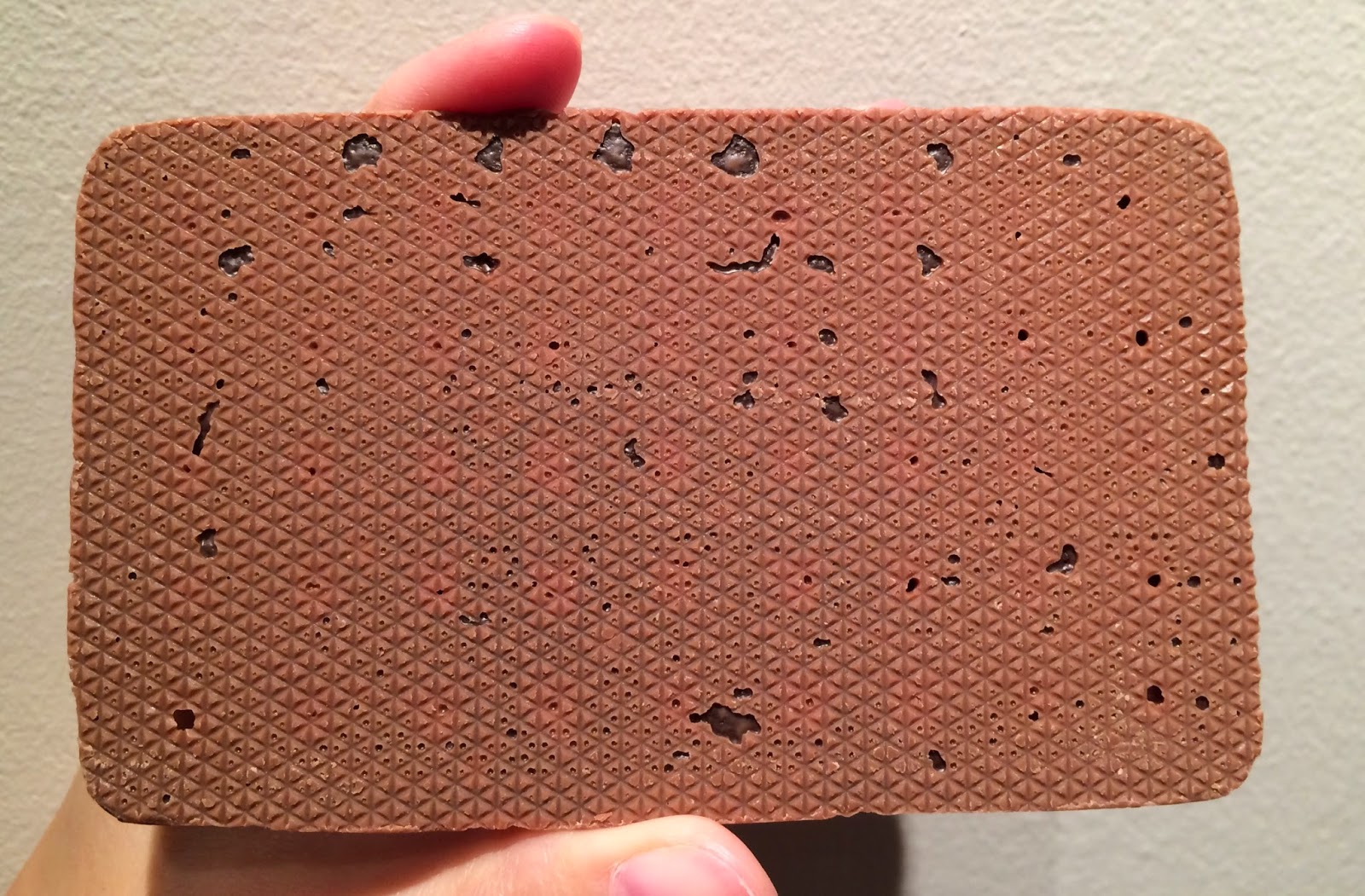
I measured the size, and the short side was a little bit shorter than 7cm (2.7 inch).

And the long side was 11.5cm (4.5 inch).
 The thickness was about 8mm (o.3 inch) and it's not as thick as regular Black Thunder.
A piece of Black Thunder weighs 26g (0.9 oz) while this BIG Thunder is 36g (1.3 oz).
Following the suggestion on the front, I broke the cookie first.
Underneath a thin layer of chocolate, there's a quite dark cocoa cookie.
 The cookie was crispy and light, and the chocolate coating was milk chocolate so that I enjoyed slightly bitter cocoa cookie with sweet chocolate coating.
The cookie was flatter and thinner than Black Thunder so that it had less crunchiness and it didn't make me full at all.
<Nutrition> --- per 1 bar (36g)
Calories: 188kcal
Protein: 2.7g
Fat: 9.5g
Carbohydrate: 22.9g
Natrium: 156mg

Another Black Thunder review.
Black Thunder Box Cake
BIG サンダーは有楽製菓が製造しているチョコレート菓子で、この企業の主力商品は
ブラックサンダーだと思う。
チョコレートにココアクランチを混ぜると濃厚な味になり、色の濃い黒さのインパクトを
どのように伝えるか企画担当の5人が話し合い、黒い雷神=ブラックサンダーと命名し、
後にキャッチコピーの「おいしさイナズマ級!」も同じ人によって考案された。
HPによると、1994年に豊橋工場で生まれた当時はアルファベットで「BLACK
THUNDER」と書かれていた。
2000年にパッケージをリニューアルし、商品コピー「おいしさイナズマ級!」が載った。
2003年8月に商品名を「ブラックサンダー」とカタカナにし、現在はこのデザインで販売
されている。(2015年1月現在)
HPを見ると、BIG サンダーは新商品と書かれていたけれど、発売日を見つけることが
できなかった。
ただ、「あのBIG サンダーが真っ赤にパワーアップ!」と載っていたので、パッケージ
デザインがリニューアルされただけだと思う。
袋の両脇にはジグザグの雷模様が入っていた。
パッケージの下側には「雷神亭まんぷく!!!」と書かれていたけれど、雷神亭が何か
よく分からないけれど、量が多く満足するということを表しているのだと思う。
右上には「割って食べてね!」と書いてあり、右下にはココアクッキーにチョコレート
コーティングがかかった商品だと図解があった。
背面には「割って食べると意外とイイネ!!」と書かれていた。
中には1枚の大きなチョコレートにコーティングされたクッキーが入っていて、小さな格子
模様がついたワッフルのようだった。
底の面は細かい網模様があり、チョコレートコーティングがかかっていない部分が少し
あった。
サイズを測ると、短い方は7センチより少し短く、長い方は11.5センチだった。
厚みは8ミリ程度で、ブラックサンダーよりもかなり薄い。
(ブラックサンダーは21g、BIG サンダーは36g)
表に書かれていた通り、クッキーを割ってみた。
チョコレートの薄い層の下には、かなり黒いココアクッキーがあった。
クッキーはサクサクした軽い食感で、ミルクチョコレートは甘さがあったので、ほんのり
した苦みと甘いチョコレートコーティングが合っていて美味しかった。
生地は薄いので、ブラックサンダーよりもザクザクした食感はなく、満腹にはならない。
他のブラックサンダー商品。
ブラックサンダー BOXケーキ
BIG サンダー
(Japanese follows. / 日本語は以下へ続く。)
"BIG Thunder" is produced by Yuraku Confectionery Co., Ltd. and the company is most known for Black Thunder, a pocket-size chocolate snack.
When they mixed chocolate with cocoa crunch, it had rich flavor, and the color was quite "dark" and "black."
5 employees who were in charge of planning discussed how to show the black image, and they came up with "Black Thunder," and also an ad-line, "Tastiness is like Inazuma (lightning)!" was created by the same people later.
According to the HP, Black Thunder was first created in 1994 at Toyohashi factory in Gunma, and all the letters were in alphabet.
Then, in 2000, they renewed the package and added the line, "Tastiness is like lightning!"
In August, 2003, they changed the package again and the product name is all in Katakana and it's been this package till now (as of January, 2015).
About this BIG Thunder, HP says "NEW" but I couldn't find any launch date, but I think they just renewed the package design as it's described as "the BIG Thunder is now in red!"
Both sides had zig-zag lightening patterns in black.
Raijin is a god of thunder, lighting and storm, and Tei (亭) is often used for a restaurant name as its original meaning is kiosk, chickee, lodge or barn in Chinese.
Manpuku is being full (from food).
So, simply I thought it implies that this chocolate snack is big and fulfilling.
On the right upper side, it suggests breaking the bar to eat.
And on the right bottom side, there's a graphic explanation that BIG Thunder is a cocoa cookie bar with chocolate coating.
On the back, in a yellow bubble, it says "It's surprisingly cool to break to eat!!"
There's a large bar of chocolate coated cookie, and it looked like a waffle with small grids.
At the bottom, it had fine net patterns and little spots were missing chocolate coating.
I measured the size, and the short side was a little bit shorter than 7cm (2.7 inch).
And the long side was 11.5cm (4.5 inch).
A piece of Black Thunder weighs 26g (0.9 oz) while this BIG Thunder is 36g (1.3 oz).
Following the suggestion on the front, I broke the cookie first.
Underneath a thin layer of chocolate, there's a quite dark cocoa cookie.
The cookie was flatter and thinner than Black Thunder so that it had less crunchiness and it didn't make me full at all.
<Nutrition> --- per 1 bar (36g)
Calories: 188kcal
Protein: 2.7g
Fat: 9.5g
Carbohydrate: 22.9g
Natrium: 156mg
Another Black Thunder review.
Black Thunder Box Cake
BIG サンダーは有楽製菓が製造しているチョコレート菓子で、この企業の主力商品は
ブラックサンダーだと思う。
チョコレートにココアクランチを混ぜると濃厚な味になり、色の濃い黒さのインパクトを
どのように伝えるか企画担当の5人が話し合い、黒い雷神=ブラックサンダーと命名し、
後にキャッチコピーの「おいしさイナズマ級!」も同じ人によって考案された。
HPによると、1994年に豊橋工場で生まれた当時はアルファベットで「BLACK
THUNDER」と書かれていた。
2000年にパッケージをリニューアルし、商品コピー「おいしさイナズマ級!」が載った。
2003年8月に商品名を「ブラックサンダー」とカタカナにし、現在はこのデザインで販売
されている。(2015年1月現在)
HPを見ると、BIG サンダーは新商品と書かれていたけれど、発売日を見つけることが
できなかった。
ただ、「あのBIG サンダーが真っ赤にパワーアップ!」と載っていたので、パッケージ
デザインがリニューアルされただけだと思う。
袋の両脇にはジグザグの雷模様が入っていた。
パッケージの下側には「雷神亭まんぷく!!!」と書かれていたけれど、雷神亭が何か
よく分からないけれど、量が多く満足するということを表しているのだと思う。
右上には「割って食べてね!」と書いてあり、右下にはココアクッキーにチョコレート
コーティングがかかった商品だと図解があった。
背面には「割って食べると意外とイイネ!!」と書かれていた。
中には1枚の大きなチョコレートにコーティングされたクッキーが入っていて、小さな格子
模様がついたワッフルのようだった。
底の面は細かい網模様があり、チョコレートコーティングがかかっていない部分が少し
あった。
サイズを測ると、短い方は7センチより少し短く、長い方は11.5センチだった。
厚みは8ミリ程度で、ブラックサンダーよりもかなり薄い。
(ブラックサンダーは21g、BIG サンダーは36g)
表に書かれていた通り、クッキーを割ってみた。
チョコレートの薄い層の下には、かなり黒いココアクッキーがあった。
クッキーはサクサクした軽い食感で、ミルクチョコレートは甘さがあったので、ほんのり
した苦みと甘いチョコレートコーティングが合っていて美味しかった。
生地は薄いので、ブラックサンダーよりもザクザクした食感はなく、満腹にはならない。
他のブラックサンダー商品。
ブラックサンダー BOXケーキ


.JPG)
.JPG)

0 comments :
コメントを投稿